
CSR · 2022–2023
CSR Digital Transformation
Unified onboarding and single sign-on across CSR's family of building-product brands.
Overview
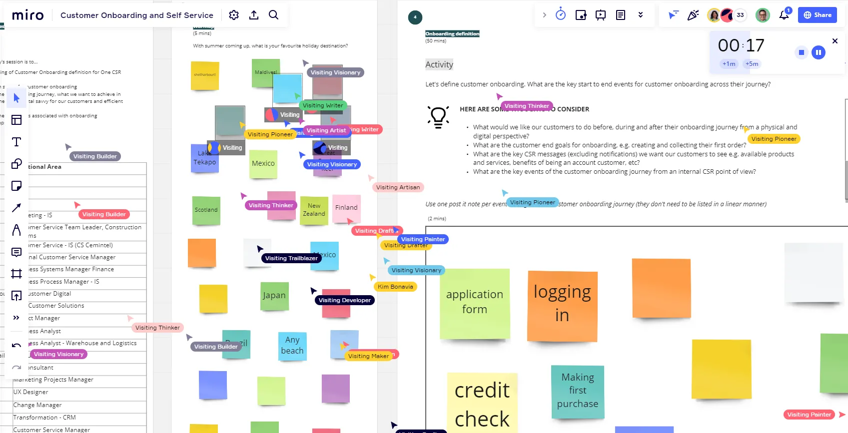
CSR's eight building-product brands, including Bradford, Cemintel, Gyprock, Hebel and Monier, each ran their own tools and account systems on top of SAP S/4HANA. This engagement focused on onboarding and single sign-on, bringing sign-up, login and real-time credit checking for trades, builders and specifiers under one coherent flow.
Brand Clarity Toolkit
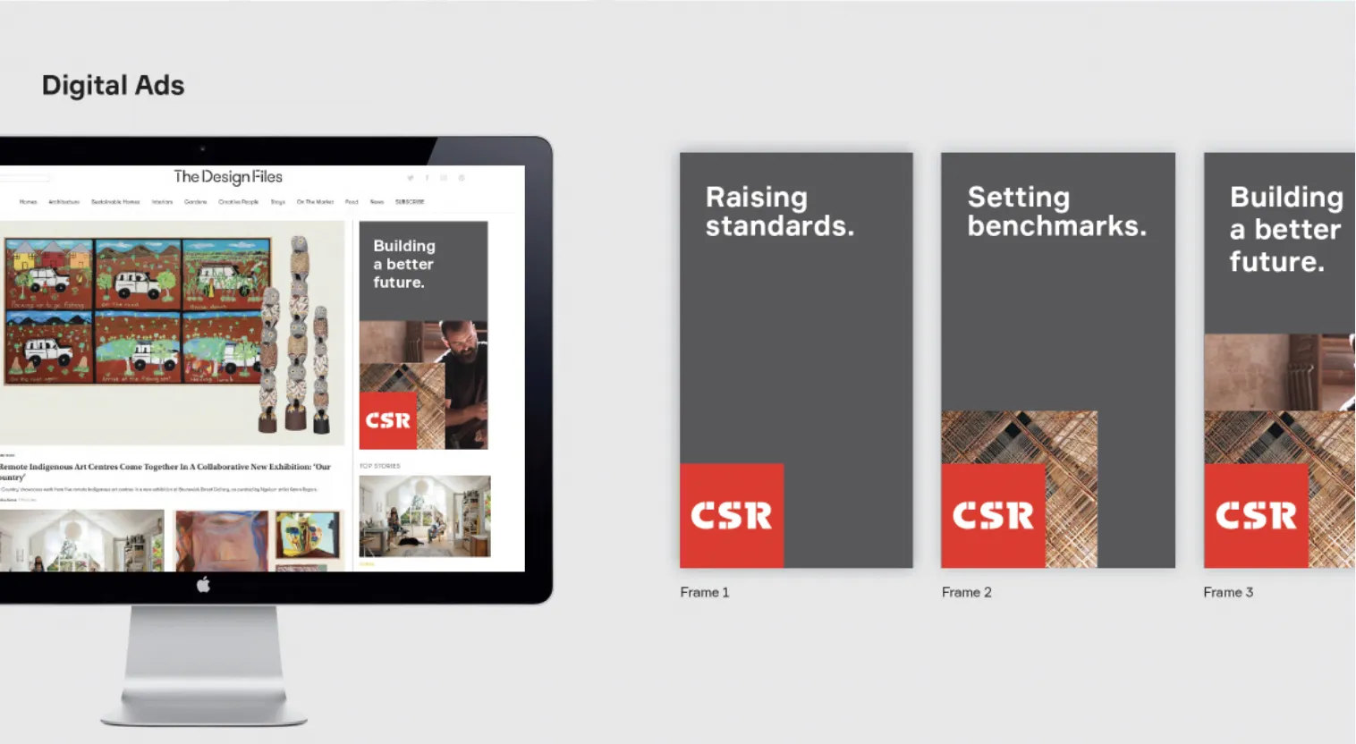
Underneath the onboarding and SSO work sat a Brand Clarity Toolkit built to keep CSR's eight sub-brands speaking with one visual language. A Modular Grid system (formed by dividing the CSR logo into sixteen equal squares) gave every layout, image and text block a consistent, on-brand structure, while a documented colour palette and UI kit kept every digital surface aligned.
Tone of Voice
A documented tone of voice sat alongside the visual system, capturing the personality and sentiment behind every word CSR's brands use: an authentic, owned style of writing built to reflect what CSR stands for, consistently, across every brand and touchpoint.
Flexible Design System
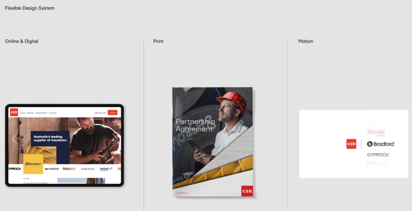
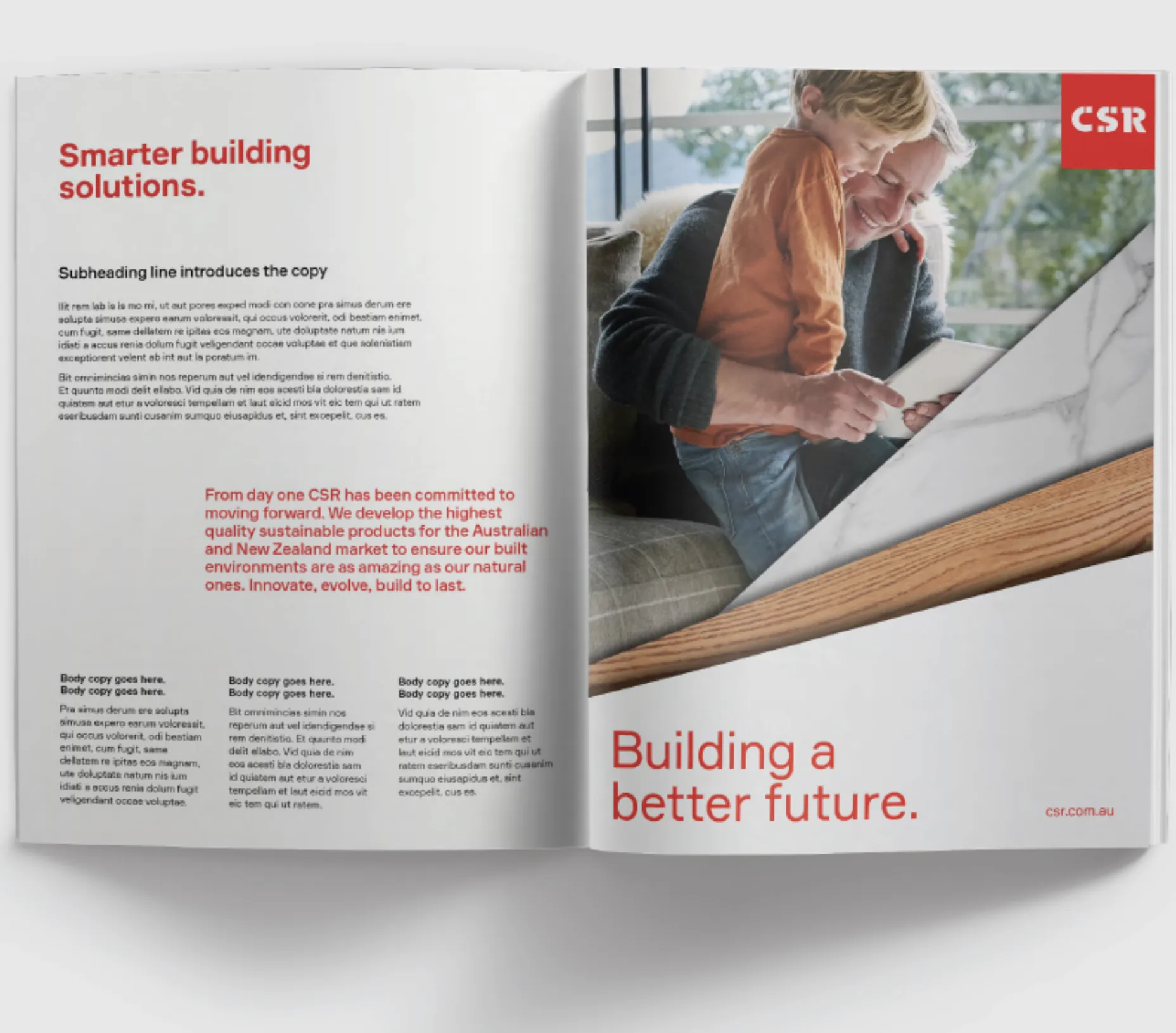
One design system flexed across three channels instead of three separate ones: modular, accessible UI patterns and responsive breakpoints for online and digital products; layout grids, Pantone references and typography rules for print; and animation principles, motion behaviours and title-card templates for video, so every touchpoint stayed on-brand without slowing delivery down.